Fantastical Portraits
Idea maps


Mood board


First Portrait
Process
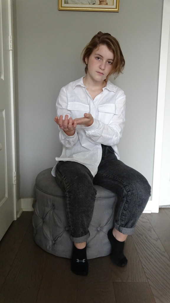
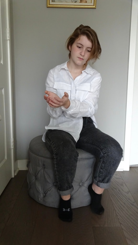
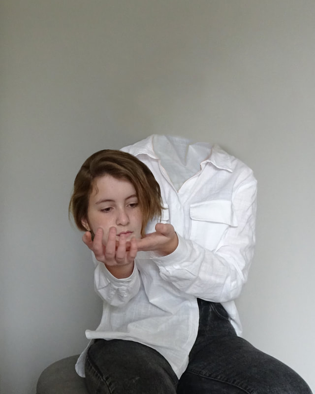
Original photo
Cropped image to 8x10; removed the head from the original photo with content-aware fill
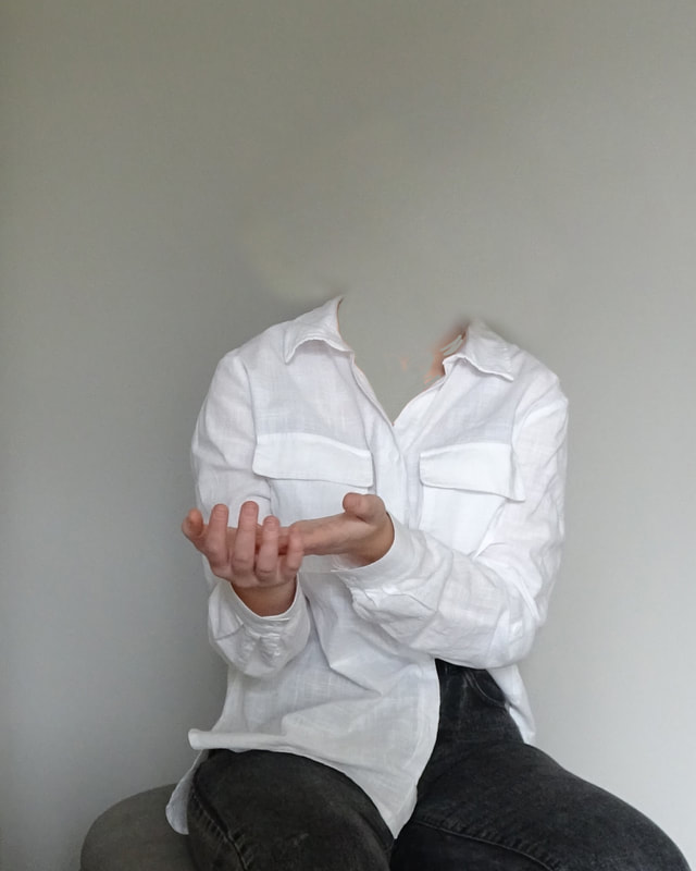
Fixed mistakes in wall with stamp tool
Added the head from another photo
Used liquify and distort to make the head appear more natural; added shadows around the head

Used texture from original photo to fill in shirt
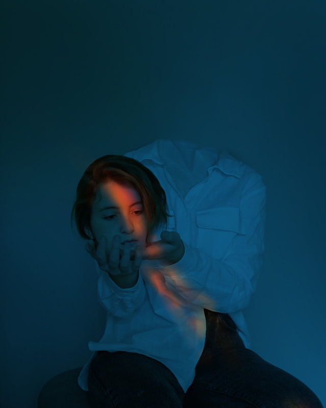
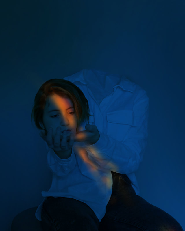
Added dynamic lighting
Final
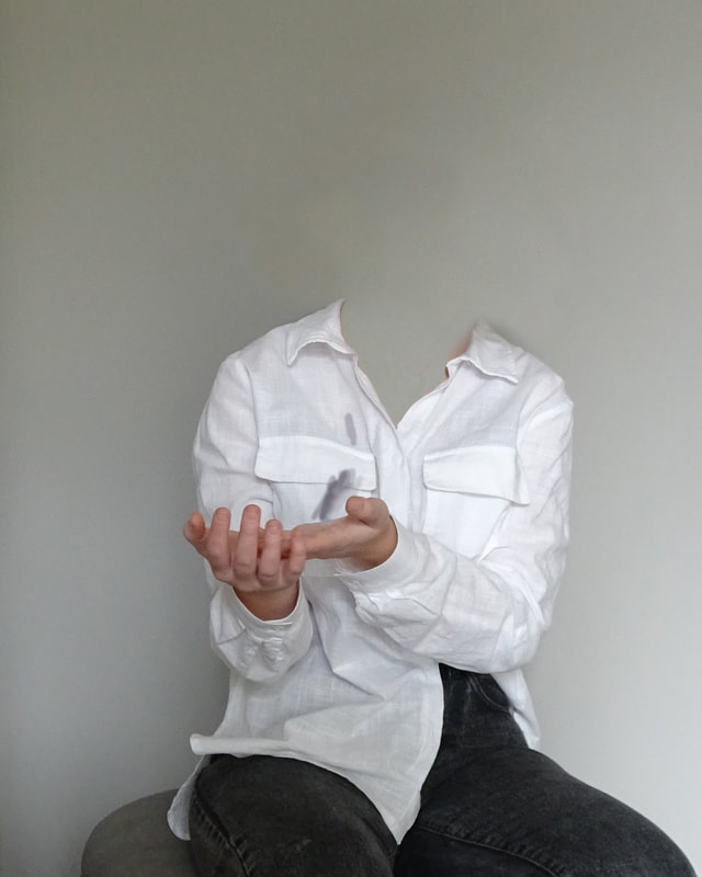
Adjusted the hue & saturation and curves
Reflection
The artwork is a Dali-esque take on a story from my life related to my personal identity and my inner vision. In the picture my head is detached and placed in my hands.
The concept of the piece is based on the year of my life when my psoriatic arthritis flared up, clamping my head to my shoulder. My mom refers to this as “the time your head fell off your neck.” To the viewer, the artwork is meant to be slightly disconcerting or creepy—like it has a story behind it, but they can only guess at what it is.
I used the principles of art and design to make some things more or less noticeable. I used a pyramidal composition to attract the eye to the main elements. I also positioned the lighting to clearly emphasize the face. The negative space is meant to add to the uncomfortable feeling of the piece.
The artwork was meant to bring a creative perspective to a pivotal experience in my life. The composition is meant to establish the head as the clear focal point. The head-on perspective, the way the head averts its eyes, and the emptiness of the shirt all add to the strange atmosphere.
Leaving the shirt “empty” was not in my original plan, so it was a bit of a risk. I originally thought I would fill it with some kind of replacement for the head, but I decided against it when I saw the result.
The piece’s strongest element is its intrigue. I think I was successful in directing the audience’s attention, as well creating an aura of surrealism. I think the weakest point is the positioning of the hands. If I could retake the picture, I would arrange them in a more natural way that could blend better with the head.
Second Portrait
Process
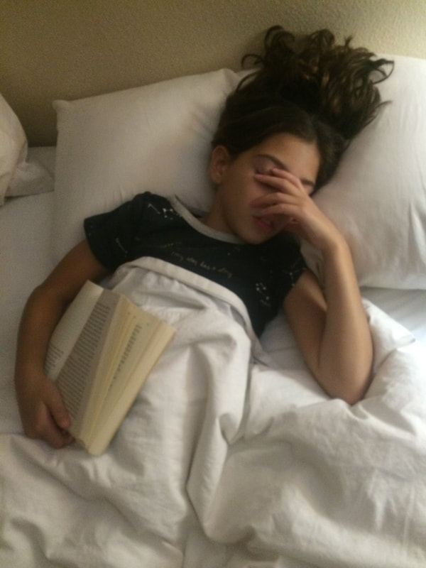
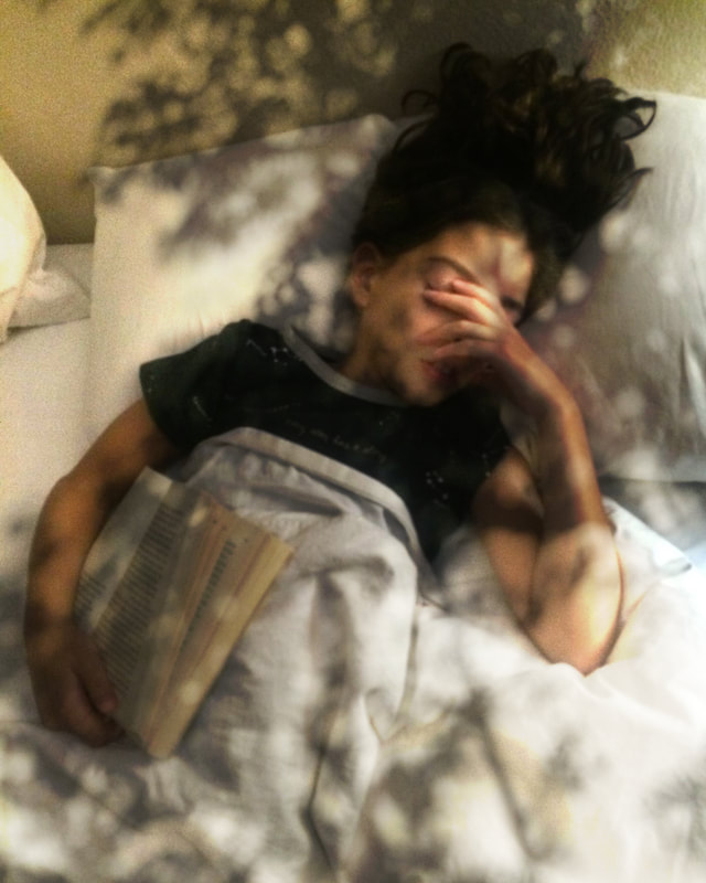
Original photo
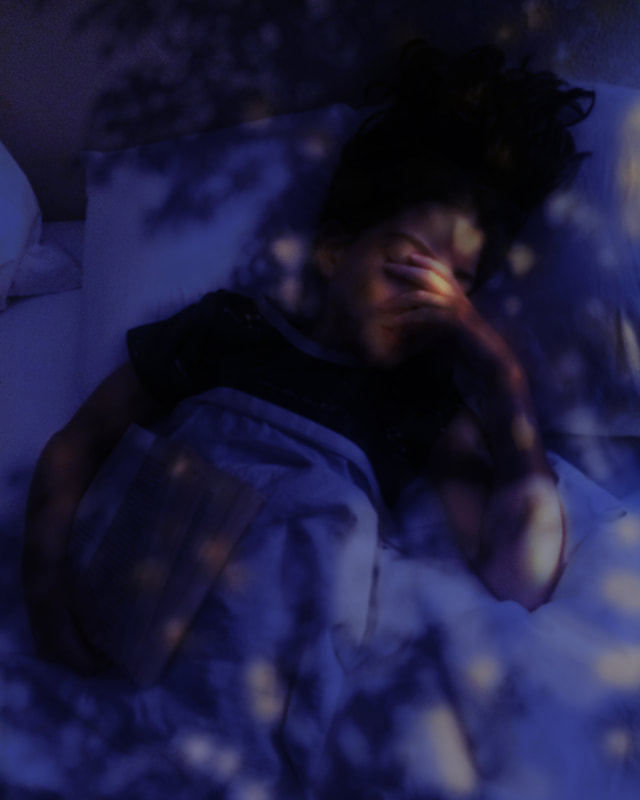
Dispersed tree shadow over the photo
Added dynamic coloring with color adjustments and overlays
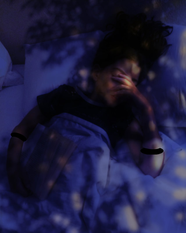
Used black circles to make the arms appear disconnected and used stamp tool to fix up areas
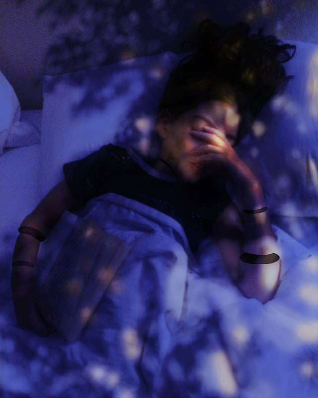
Final
Adjusted curves to alter the lighting
Reflection
This piece shows my friend, Siena, from an overhead view. She holds a book in one hand. Tree branches shade the scene. Her arms are photoshopped as if they are disjointed. The colors are dynamic.
For this piece, I wanted to literally provide an alternate perspective by shooting the photo from an overhead view. It also reflects Siena's personal identity, as reading is extremely important to her.
I used the principals of art and design to draw attention to Siena's face. Like the prior portrait, I wanted to keep the mood of the portrait mysterious. To do so, I kept the disjointed arms somewhat obscured by the shadows of the tree.
The composition is arranged to draw attention to the main subject, as well as to creatively frame the portrait. The colors were similar in both portraits because I enjoyed the effects of the lighting in contributing to a somewhat disturbing or uncomfortable theme.
My biggest risk was with the arms, because depending on the execution, the disjointed effect could be effective or not. My ability to execute this was a skill derived from the hybrid animals project.
The greatest strength of this piece is its similarity to an oil painting. However, I think its weakest point is its simplicity.
